Tech
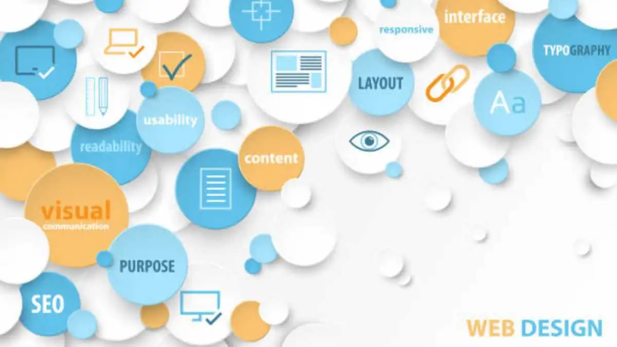
The Role of MicroInteractions in Modern Web Design
Do you want to improve the usability and appeal of your digital interface? By incorporating modest yet powerful components into your site design, microinteractions can enhance the user experience overall. Beyond aesthetics, these interactions produce a responsive and dynamic environment that leads people through your digital area with ease.
We’ll get deeper into the definition of microinteractions, their use in web design in Sydney, and how to incorporate them properly in this blog. Microinteractions are essential for influencing how people view and utilise your digital product, whether that means facilitating smooth interactions or giving them immediate feedback.
Table of Contents
What are Microinteractions?
Subtle animations known as microinteractions are used to give a user interface life. Despite their diminutive size, these expertly designed animations fulfil a practical role by visually engagingly reacting to user events, including clicks, hovers, and scrolls.
A button that changes colour when pressed, a sound alert when a message arrives, or a little vibration when a mobile device function is completed are examples of micro-interactions. By providing a layer of responsiveness and visual feedback to user activities, they significantly improve the entire user experience by making user interactions more intuitive and captivating.
Major Microinteraction Elements
1. Trigger
The trigger is where the microinteraction starts. It is where the user’s input or action is triggered. The micro-interaction could begin with a click, swipe, hover, or any other particular gesture.
2. Rules
A collection of circumstances known as rules specify what occurs when a microcontact is initiated. They define how the system reacts to user input, deciding on the precise result or interface modification. Additionally, they impose restrictions on user behaviour and provide helpful guidance when users reach these restrictions. For example, if a password has no special characters, an error message can show.
3. Feedback
After the micro-contact is initiated, the user receives feedback from the system in the form of an audible, tactile, or visual response. Make My Website experts say it conveys the outcome of the user’s action and contributes to a smooth and responsive user experience. It can manifest itself in a variety of ways, including colour or shape changes, progress markers, or auditory indications like sound effects.
4. Loops and Modes
The microinteractions that influence the temporal characteristics of user engagement are defined by loops and modes. Continuous interactions, like a loading spinner that keeps turning until a task is finished, are called loops. In essence, they determine how long a microcontact lasts, whether it repeats, and how its properties change over time. On the other hand, modes—like an on/off toggle switch that alternates between two states—represent distinct states of a micro-interaction.

Different Types of Microinteractions
1. Click and Tap
On desktop computers, clicking is a user interaction carried out with a mouse or other comparable pointing device. Buttons, links, and other interactive components are activated when a user clicks and releases the mouse button. In contrast, tapping is done with a finger on touch-enabled gadgets like tablets and smartphones. A tap occurs when a person contacts the screen and then swiftly releases their finger.
2. Scrollbar
The visual and interactive component that enables users to browse through content in a scrollable area—like a webpage, document, or application—is referred to as the scrollbar. It works by dragging, clicking on the track, or scrolling vertically with touch movements.
Hover effects, fluid scrolling transitions, scrollbar fade-in/fade-out depending on user activity, and scroll indicators that display the user’s position inside the content are examples of microinteractions related to the scrollbar. By offering visual clues and feedback to improve the user experience during content navigation, these understated design components add to a digital interface’s overall usability.
3. Pull to Refresh Animation
One UI design pattern that is frequently utilised in mobile applications is pull-to-refresh animation. Make My Website professionals say users can manually refresh content using this design animation by dragging the content area with their finger or pulling down on a touchscreen. Apps that show dynamic material, such as news stories, email lists, or social media feeds, frequently leverage this interaction.
On touch-enabled gadgets, users make horizontal movement gestures called the swipe effect to move between different pages or trigger specific actions. Users need to perform a swipe motion, either left or right, between pages and graphics and interface segments. Users experience an engaging journey that often triggers visual animations as well as transition sequences and content modifications through this particular motion. Mobile app applications adopt the swipe effect as a principal feature that lets users browse content while performing basic swipe gestures for interaction.
4. Progress Bars
Users observe the status of tasks or ongoing activities through a graphical bar known as a progress bar. Users can monitor operation development through contemporary visual cues thanks to the progressive horizontal bar that tells them how to download files or how application installations are moving at any moment. The micro-interaction demonstrates how users advance toward reaching their particular goal.
5. CTA
The frequent use of call-to-action buttons in web design in Sydney serves three main objectives: attracting viewers and increasing user interaction while driving participation, which translates to more conversions and commercial achievements. Buttons serve as key directional indicators that users need to fulfil diverse objectives like purchasing, downloading, or registering. Websites achieve high visitor decision conversion rates by incorporating creatively designed calls-to-action buttons strategically positioned throughout the page framework.
6. Notification Bell
The notification acts as a visual cue that alerts or notifications are coming in. Usually symbolized by a bell-shaped emblem, it alerts users to events, changes, or new communications on a digital platform. The bell may change its design or show a badge when there are unread alerts, alerting users to check for changes. Users can visit a notification centre or get a quick summary of previous alerts when they engage with the system, such as by clicking on the bell symbol.
Conclusion
Adding microinteractions is crucial to keeping users interested in your offerings as technology advances. As was mentioned, these minor yet significant design components enhance websites’ overall usability, accessibility, and aesthetic appeal. Because of this, including them in today’s web design should be regarded as a strategic need rather than merely a fad.
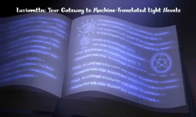


Luxiamtln: Your Gateway to Machine-Translated Light Novels

Crichd: Watch Live Sports Online

Why Do Small Healthcare Practices Struggle with Efficiency?

Clochant: A Symbol of Nature and Ancestry Across Cultures

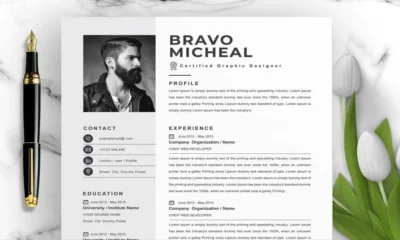
Tips for Choosing a Job-Winning Resume Template

Best Quality Finish Apartments in Dubai: Luxury Redefined

Sumosearch: AI-Driven Search Engine

Orfomi Cursors: Customize Your Mouse Pointer Today

Lepbound: A Structured Approach to Decision-Making in Optimization Theory

License to Kill: A Homicide Private Investigator Explains British Dr. Harold Shipman’s Murderous Killings

Percolator Bong: The Ultimate Guide to Smoother Smoking

WQR2548: Platform for High Voltage Handling & Durability for Every Industry

Discover the Elegance of the Chanel Boy Large Bag: A Timeless Handbag

Ashcroft Capital Lawsuit: What Investors Need to Know

Where to Buy Authentic Port Authority Clothing Online
-
 GENERAL2 months ago
Uncovering the World of кинокрадко: The Dark Side of Film Piracy
-
GENERAL1 month ago
Unveiling the Art of преводсч: How Translators Bridge Language Barriers
-
YOGA1 year ago
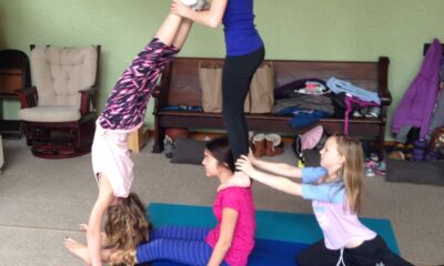
4 Person Yoga Poses for Beginners
-
GENERAL3 weeks ago
Christofle – For Those Who Dream of Family Heirloom Silver